
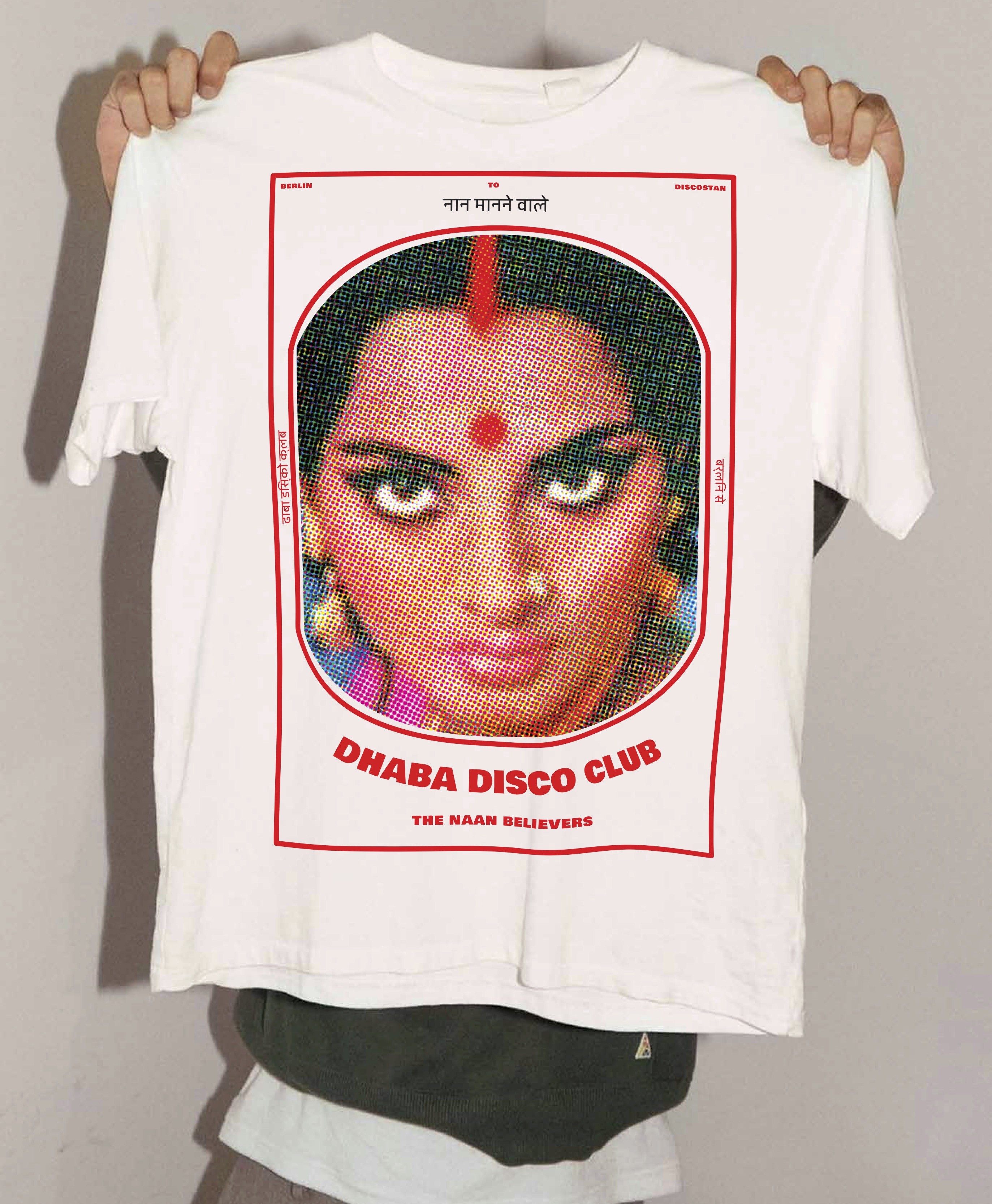
Dhaba Disco Club
Our concept took inspiration from vintage Bollywood power, truck stop aesthetics and hand drawn lettering. We wanted to do the idea of "Bombay Style Streetfood" justice, honoring the legends of Indian cinema and paying an authentic homage to it's beautiful visual language.
Client
Dhaba Disco Club
Industry
Hospitality & Gastronomy
Services
Creative Direction
Brand Strategy & Design


Concept
We developed an incredibly detailed and thoughtful concept to really evoke feelings of bollywood nostalgia.
A salute to Bollywood of the 70s/80s/90s which fully embraces that aesthetic, goes full in on the glamour and retro-cool with tributes to it's heroines first and heroes second.
We wanted to underline modern values, female empowerment, and honor heroines of indian cinema and culture from the incredible Rekha to the Maharani of Jhansi.


Primary Logo
With an concept driven by bollywood nostalgia, the temptation to channel exactly that feeling in the primary logo was strong, but we chose a deliberately modern, western, street-style inspired chunky custom letter that breaks with the norm, associates with fast rather than indian food and leaves a unique, memorable impression.
Wordmark
The brand font Bowlby was the perfect base for a simple, powerful and authentically rough wordmark.
Clear and legible while still fitting neatly into the b'wood retro identity, the typeface set a great contrast to both the modern chunky primary logo and the calligraphic logo, while tying aesthetics together with it's imperfect, authentic hand-drawn characteristic look.
Calligraphy
To honor the Indian roots of the brand and underline the identity of "truck stop eatery", we drew a custom calligraphic logo for Dhaba Disco Club from scratch, taking references from old hindi typefaces and hand lettered shop signs that often work with basic 3D shapes and extrusions and simple geometry.
Typography
To really stay true to the concept, a additional hindi typeface was chosen and a careful match for the extremely heavy custom logo was found in a Bowlby One as a headline font in combination with Kneewave as a hand-lettering inspired body font.


Color Scheme
Indian truck stop aesthetics mean strong dirty primary colors, hyper saturated contrasts, direct in your face, but also simple, naive, rough - a unique and captivating visual language we have always been fascinated by during our visits to India.
We wanted to be unapologetic, loud and authentic colors to really capture this spirit
Turmeric yellows, saffron orange, strong reds built the main colors palette for this project.


RELATED PROJECTS
Brand Strategy & Design